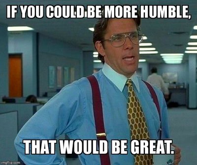
“...we want the logo bigger”
“Nope!” Read why we’re not being jerks
Firstly, for anyone out there that's requested their logo to be bigger, we aren’t setting out to offend. This isn’t a ranty post, we’re here to help and educate! As a client if you have made this request before, you’re not alone, it’s probably the most requested change in design-land. Let’s find out why.
Why do clients want this?
Hmmm…good question.
A reasonable request.
It seems that clients want their product or service to be noticed. Fair enough.
Another reasonable request.
Clients tend to think that the logo is the start and end point to who they are and what they do. This isn’t true. They want their face (logo) to be the memorable, noticeable and most visible piece of content on the page. We’ll go into why this isn’t a good idea a bit later on.
An unreasonable request.
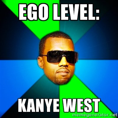
Some clients just want the logo to emulate the size of their ego - aka the whole top banner section for example. This is very rare and often misinterpreted.

How we say no
Saying no for some people is one of the hardest things to do. Saying no the right way is nearly as hard sometimes.
Here’s a few examples of how a designer's ego can get in the way and how it usually goes down:
Saying yes the wrong way - “yeah sure whatever…. dummy…”
Meaning, ‘I don’t want to deal with your dumb request and can’t be bothered communicating why it’s a bad idea’. Education is the key here, we’ll get to that.
Saying no the wrong way - “no, it’ll wreck my awesome design…. dummy…” (or words to that effect).
OK, so I’m adding “dummy” on the end for dramatic effect.
In this situation, the comment is kind of right, just not communicated with any helpfulness or education. A client usually hasn’t gone to design school or created numerous sites like the designer. A big logo will throw out the balance of a design though.

Education over ego
For designers - stay calm...
Why do a lot of designers get offended by the ‘bigger logo’ request?
Maybe there’s a perception that the client doesn’t like the design or the client thinks the logo is the best part of the design or just that the client has bad taste (which can happen too…no offence). It’s hard not to be a little put out by certain requests or feedback from time to time. I’ve been guilty of this on numerous occasions.
So what’s a designer to do?
If a designer has gone through all the right processes in designing and mocking up a site, you should have enough reasoning to back up what you’ve done. Use some of the points below to help educate clients why they shouldn’t make the logo bigger.
For clients - why you don’t want a logo bigger
- Visually - As mentioned before, a bigger logo can and usually will throw out the balance of a design. Doing this would make a site look visually unappealing and uninteresting. We don’t want that.
- The “get noticed more” argument - Some clients claim a bigger logo will enable the user to understand who you are…. But the user will already know who you are because they’re already on your site!
- The “It’s who we are” argument - Nope. Your logo is not you. The product or service is who you are and what you represent. The product or service should be the most prominent content on the site, that’s what users are there, not to look at your logo.
- The “It’s brand recognition” argument - Again, make it about the product or service and the user. Your logo is not your brand, not even the whole site is your brand. Just as visual assets are part of your brand, so is the way you act, talk, dress, write and communicate verbally to people. There are many different aspects to what makes a “brand”. If you want to explore more about this, here’s a few things we wrote about that here.
Finally...
If you’re a designer, and a client has requested the logo to be bigger, you’ve gone through the above educational retraining and they STILL want the logo bigger, what do you do?
Compromise.
Explain you will increase the logo size slightly and see how it looks. Usually this will appease most clients - they get a bigger logo, your design doesn’t get thrown out of proportion. Win/win.
Hope this has helped both designers and clients!
about-seed
